One of the hills I’m willing to die on is that your website needs a refresh every two years. That’s because the internet makes the world move so fast and by the time two years is up, your stuff looks “so 2017” or whatever.
I was talking to Anne, who runs a wildly popular gift blog, Unique Gifter. She puts out a lot of content and the strategy pays off to the tune of hundreds of thousands of visitors per month which translates into affiliate revenue from the purchases that happen based on her guides.
When I say she creates a lot of content, I’m not blowing smoke.
Last year, I think she and her team of writers published more than 700 new posts, not to mention the work they did on the existing posts that also get a bunch of traffic.
However, it’s time for a website makeover.
I feel qualified in saying this because I did the original logo and helped with the design of her page, but check this out:

So 2017, know what I mean?
Actually, it still looks pretty cute, but I’m dying to redo a few things.
Her focus is still on getting more posts published in time for Google to index them so they show up before the next holiday.
“Your website needs a makeover,” I texted her.
“I know, but it’s not my priority right now,” she replied.
“I have a few minutes before my next call, let me play with a new logo at least?”
She knew I’d do it anyway, so she acquiesced. I promised I wouldn’t play with the color scheme until she’s actually ready to go through with the redesign, but I played around (and I really do mean ‘play’ because doing this kind of thing is fun for me) and came up with:

(version 1)
I kept playing, and came up with:

(version 2)
I thought the box was WAY too big, so my last (and final because I didn’t want to get any flack from her about spending too much time on this) iteration of her logo was this:

(version 3)
I like this. It’s legible, has fun fonts, a cute graphic, and actually looks pretty good in black and white.
I don’t typically do logos in just black and white, because hello this is the internet and doing things in color costs the same as not, but I like this.
Once Anne is ready to do a redesign, we’ll use this as inspiration and find a new color scheme. I see those little sparkles coming through in one color, then using that accent color elsewhere in the logo (maybe the whole word “gifter” or something).
Here’s what I’d make her homepage look like:
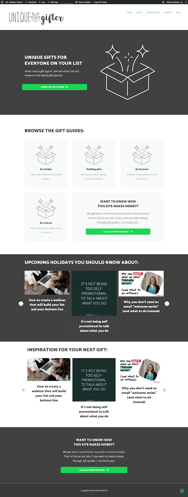
The things that will change once I’m creating a layout on her site instead of mine include:
- Using her menus instead of mine
- Using her blog posts instead of mine
- Creating a different call-to-action on the bottom (or at least word it differently!)
- Coming up with a color scheme that isn’t off black and lime green
- Coming up with different font combinations than the default ones here
Things Anne needs to do before she gives her site a makeover
There are a couple of content things Anne needs to do before we roll up our sleeves for the new WordPress theme.
1. Create browsable category pages (and update the ones you already have)
When I was looking at the design, I noticed something: Her menus don’t have a category home.
Let me explain.
See her menus here:

Each of these has a bunch of sub-menu items, but almost none of them have a nicely laid out visual of the different categories.
So, for each of the menu items, she needs to create a page that has links to the sub-menu items. Her site is MADE for browsers (people who browse, not internet browsers!), so this one step can go a long way to helping enable them.
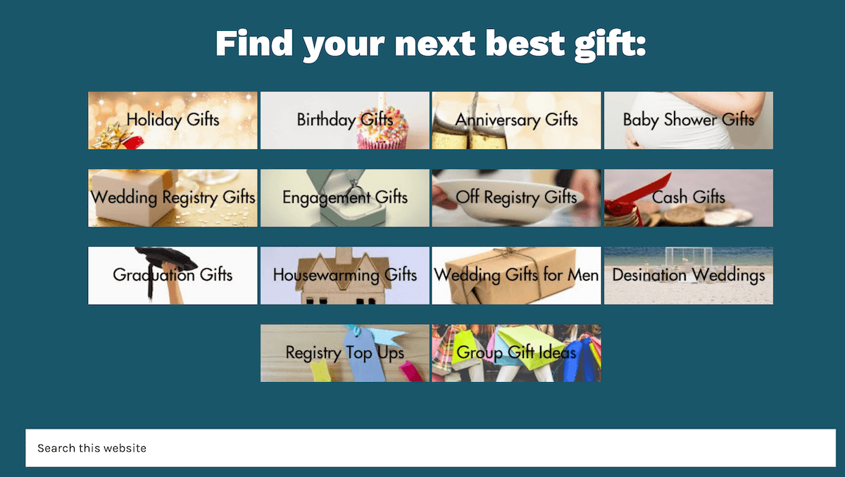
2. Create different buttons for her home page and sidebar
Again I feel comfortable harping on this because I designed these a couple years ago and I’ll be the first to admit they no longer serve her. At least from a design standpoint. I’d be interested to see a heat map of where people are clicking when they get to her home page, but since I don’t have that information, I’m going with my gut here.
These are the buttons I’m talking about:
Home:
Sidebar:
We can do these together and make them much more dynamic. Which leads me to my next idea:
3. Consider listing all categories on your home page, and link to the most popular post in that category
Unique Gifter has a lot of content.
An overwhelming amount, if we’re being honest.
That makes me think of another site I designed, Student Loan Planner. His site is also packed with content, and one of the ways we kept people interested on his homepage was to separate his articles by category, then link to the most popular post in that category. Although “most popular” is relatively subjective, and Anne can decide which post needs to be the most visible in each category.
Here’s what I mean:
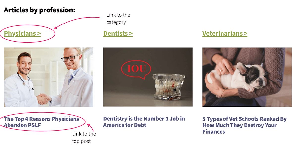
This looks nice, keeps people on the page, and most likely (since this client does have heat mapping and checks for stuff like this all the time!) gets people clicking on the posts they most want them to read.
Stay tuned! I’ll update this post once we actually redesign Unique Gifter’s home page.
Update: her website redesign is done!
I’m so excited to see Anne’s traffic increase (and it already gets so much traffic that increasing it will be awesome). We rolled out the new design yesterday, and here’s the top part of the home page:

I like it because it’s simple and draws your attention to the call to action.
Just below that are different lists of links to get you to navigate to different pieces. We used emojis, which is fun and full of whimsy:

The final piece of her home page that was missing before is where we link to her digital product:

She created a course after unlocking the key to making money with gift guides and launched it last year. It didn’t sell as much as it should have because while her friends are bloggers, her audience is consumers looking for unique gift ideas. But my hunch is that drawing attention to it on the home page like this, plus lowering the price point so it’s “book priced” will increase conversions. I can’t wait to find out.
Another thing I can show you that I really like are the category pages, which, to my astonishment, she did not have before.
Check out the “by occasion” page:

The links at the top navigate to different parts of the page, which is great for people who are looking for inspiration on this site.
Other things I really like include:
- Infinite scroll per category. So if you click “browse all anniversary” you can scroll and scroll without having to click anything.
- Infinite scroll per post. This one is really cool, too, and helps people who are simply browsing. Once you get to the end of a post (like this one) another one simply appears.
- The full-page search. If you click search in the menu, you get a big screen. For a site that has a ton of content, I love how simple the search is.
I also love the logo, which Anne and I agreed didn’t actually need any color. I love the color scheme, which isn’t all that different than before (it’s still blue and orange, just updated), and I love how clean and easy to navigate everything is.
Do you need a WordPress makeover?
If so, let’s talk.

