
I just finished a really fun project with a new client, Daniella Flores from I Like to Dabble. She’s already unlocked the “how to get massive traffic to your website” piece of the puzzle, and she came to me looking for a site redesign.
She wanted branding, which is an EXCELLENT place to start.
We had a really interesting back and forth where we were in the same Google document at the same time, and I wanted to show a bit of the behind-the-scenes process.
Because design, especially logo design, is iterative.
Step 1: Ask client to fill out a huge branding document
I have this great (if I do say so myself) branding document that allows the client to figure out their brand. It goes way beyond colors and fonts, asking questions like, “which music style does your brand best align with” and it’s really helpful to have as step one.
So I sent it to Daniella, and she got it back to me in about 24 hours.
She already had some ideas for colors, and I was excited to play with rainbows.
Here’s what she said she wanted with her colors:

So, armed with that, I was off to the races.
Step 2: Start building some basic to-be-refined-later logo concepts
I really like taking some first stabs at different directions. My usual logo style is text only (or text mostly, plus one other element) but I thought this time it would be fun to play around with badges and whatnot.
My rule for this stage is to create as many different logos as possible in a condensed time period. And they should all be DIFFERENT so the client can see that we’re at the beginning of a journey with a bunch of different roads we can go down.
So, I set a timer, used her colors above, and got to work.
After that, it was time for feedback (and it was also time to step away — you get too close into a design program and you sort of feel like the kid who’s been staring at the Magic Eye posters for too long at the mall, stay tuned for more extremely relevant and timely references).
So I sent them, with a note, and asked for feedback.
Some people might not like sending rough ideas to clients, and in the past that would have given me pause, but I remembered that Daniella hired me, not “some people” so I don’t have to worry about what others would do, or what anyone thinks I should do.
That’s honestly quite powerful. Even though I’ve been running my own business now for several years, it’s easy to get swept up in doing what some ethereal “they” think I should do.
But I digress.
Step 3: Involve the client as early as possible
With Daniella’s brand direction, plus her design guide (pastel rainbow + dollar sign somehow incorporated) I sent her the following logos and asked for feedback.
Here’s what I sent:
“Hi Daniella!
Here are eight very different logo directions. Not all of them have money incorporated into the logo, but narrow down the choices before we refine.”
Logo 1

Logo 2

Logo 3

Logo 4

Logo 5

Logo 6

Logo 7

Logo 8

Her notes indicated that I wasn’t going in quite the right direction, so she sent some logos she liked, and made notes about what she liked about them. I will update my branding document to include this step in the future because it would have been SUPER helpful in this case. I didn’t know until this step that Daniella had an idea of what she wanted her logo to look like.
She liked the dollar sign in Money Can Buy Me Happiness.
She liked the colors and the gradient of this logo that she found via a Google Image search:

She added another image of a logo she liked, which again showed the gradient:

After she showed me a few ideas, she mentioned the picture in her head of what she wanted her logo to look like.
Step 4: Iterate early and often
Armed with that feedback, and those examples, I sent her the next round of logos:
9 |  |
9a |  |
10 |  |
She realized after she saw these colors together that they just didn’t represent her brand. She wanted colorful, vibrant, expressive gradients, and the colors she thought she wanted gave off a VERY different vibe than what she initially requested.
Now that she saw them as part of her logo, she thought they looked too pastel, too childish, too… Easter bunny? And I had to agree. But when a client sends me SPECIFIC colors to work with, that’s what I work with. This is why the collaborative process works so well. It’s flexible and transparent enough so the client doesn’t have to take the designer into (much) consideration when they realize they sent them down a path that doesn’t really serve them.
Step 5: Change color scheme and send new options
Be flexible and ready to change directions as necessary
Daniella asked for more adult colors, but to keep things colorful, and to keep her original teal color, #54ccbe, and these were the options I came up with:
Option 1:

Option 2:

Option 3:

Option 4:

I really liked option 4, which makes me think of the George Carlin joke, “of course it’s the last place you look. If you find it, why would you keep looking?” because once I found this combo, I didn’t wait for Daniella’s feedback on colors, I went right back to Affinity Designer (which is like Illustrator only it costs $50 once instead of monthly) to see how logos looked with the new colors.
Logo 9 with color scheme 4:

This is 100% opaque color, no blending. Just wanted to see what the colors look like together, and I like them enough to take this and run with it.
Logo 11 from inspiration #1:

I hadn’t gotten Daniella’s feedback on the new colors, remember?
But I was dying to see how they looked with a refined concept, so I went with it. I sent this one and said that we could swap out the pink and orange if she didn’t like it, but made sure to tell her that I did love it, and this logo struck a chord with her. I knew it would. Well, I hoped it would, because it was MY favorite of the bunch.
But I wanted to send a few more, so I kept the new colors and sent this one too.
Logo 12 from inspiration #1:

Same idea, different font. But not nearly as eye-catching as #11. Daniella agreed.
Step 6: Refine the logo concept together
There was one more logo that we tried (Daniella had mentioned she really liked a script font logo from a Google image search) but it wasn’t nearly as appealing as #11, so we scrapped it.
Then we got to work. And somehow, through the magic of technology and aligned schedules, we were working in the same Google doc at the same time, which made it feel like we were in the same room.
It also cut days — DAYS — off the design time.
I’ll share below:
Logo 1:

First, logo 11 becomes logo 1 or we will both go crazy.
Logo 2:

Next, “I like to” goes on a diet. Ebook forthcoming.
Daniella likes both one and two, which she tells me almost as soon as I put this one in.
Logo 3:

The whole logo tries on a new outfit. From color scheme 3.
Somehow the other colors make this look like a basketball team’s logo. The Portland Trailblazers, specifically. Daniella didn’t like these colors as much as the original, and neither did I.
She asked for some rearrangement. She didn’t like where the dollar sign was, and asked for it to be incorporated better.
Which led me to think about and visualize different places to put the dollar sign.
Logo 4: $ to the left

Logo 5: $ in the background

Logo 6: $ in the “o”

The consensus was that the dollar sign definitely belongs on the left. Now, the final question remained — which weight of font was best for the first part of the logo? Logo 4 had light, and the font family we chose (Montserrat, to go with her webfonts on her site) has a whole bunch of options, so we wanted to see what it looked like at a heavier weight.
Logo 7: Montserrat regular

Daniella liked this better than the light, so let’s try one weight heavier.
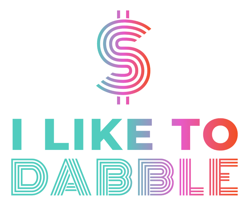
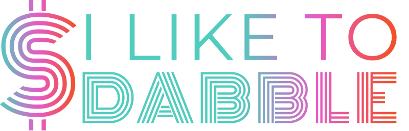
Logo 8: FINAL PICK: Montserrat bold
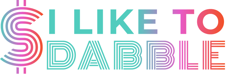

She went back and forth between logos 7 and 8, but ultimately, she said she was a sucker for the bold font, so this became her logo.
The site icon was pretty obvious, too:

Daniella sent me an email after we went through this process, apologizing for having so many opinions.
“Are you kidding?” I wrote back. “This is the most fun I’ve had in weeks!”
It was so fun to feel like I was in the same room as a client. Also, it sped up the logo development process considerably.
We did the same thing with her website, which meant that when we turned on her new design, she had EXACTLY the website she wanted.
Now she’s happy to play show and tell, and I’m happy to have her site in my portfolio.